Thursday, May 20, 2010

Character design


In every character design before it is used in animation, it is all based on shapes and easy drawings. The characters from Madagascar and the movie UP is really successful with real life features. The characters from these two movie consist of animal and human animations. Marty the zebra in the movie Madagascar, has a feature of Chris Rock in the zebra form.


Character Design


Character Design:


Name: Smith S.
Age: 23
Occupation:
Status: Single
Weight: 52
Height: 130cm


Mr. Smith is a billionaire who is an owner of mega malls all over the world.
He is young but really talented, helps the poor and is a kind man. He is created by
scientist using monkey and human genes making him able to talk and think like humans.
He lives in Beverly Hills and is a recognized man. He is a test which scientist has created
in order to keep different species but at the same time develop them with technology.
The animal species will be saved by this technology, and will not lead them to extinction in
the future. Smith's hobbies are: being a DJ in different clubs, in car racing clubs and also
plays different sports such as soccer and softball. He decides to stay single and make himself
successful, rather than having a family.

Tuesday, April 6, 2010

Successful and Unsuccessful ads:

The picture above is an advertisement of the movie Kill Bill several years ago, which i found interesting.

Unsuccessful:

The Dunhill advertisement is placed in a magazine on two pages. The advertisement is trying to advertise a perfume. The advertisement is consist of a good looking model to draw attention, the logo of the product and lastly the product itself. Although this ad is viewed as classic, the use of color or the theme of the ad uses the various shades of blue, makes it a boring advertisement. It doesn't attract customers and if it was in a magazine, people would probably just flip through the pages without even being bothered what it was about nor be interested in it. The advertisement would probably gives the model the main attention when the viewers view it since the product is the same tone of color as the advertisement making the product blend into the rest of the page. This makes the advertisement unsuccessful.

This advertisement above is placed inside a bus, use for holding on to on the bus. Just from the idea seen in the picture, i think it is really creative because it is applied directly on the customer's wrist directly giving them a chance to see how the watch looks on the customer's wrist. On the strip it says "try it here, the big pilot's watch". Maybe some customers haven't been able to go in actual stores but since this is placed all over, it is an opportunity to try it on. By placing this ad in different types of transportation such as buses in different areas, MRT, BTS, monorails would also be a benefit for spreading the advertisement. How ever, the ad itself is boring, and doesn't grab attention with its neutral colors, but because the intention of the advertisement is just to get the watch on their target customers wrist. Personally, I like the ad because it is very effective and really creative and at the same time, everyone will naturally hold on to the strap when they're on a transportation and the clock would just be on their wrist right away.


Tuesday, February 9, 2010


Found Object Project
Word Art Project


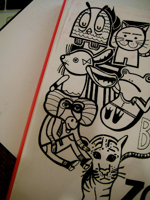
A trip to the zoo (Safari World)
Feb 8, 2010

Personal Logo (Graphics 1) 9 Feb 2010